Online Cource - Jagotech
Company X, an edutech company, is planning a major revamp of its learning platform, including the interface and system structure. The platform offers various online courses such as Programming, Digital Marketing, UI/UX Design, Product Management, and more — aiming to develop digital talents in Indonesia. However, over the past year, the company has experienced a decline in revenue. After conducting some research, they found several issues: The platform's appearance is unattractive 1. It’s difficult to use 2. Slow loading time 3. Users lack motivation to study 👉 Because of this, Company X plans to redesign the platform to make it more visually appealing, user-friendly, and able to increase learning motivation.
Client:
Casestudy Skilvul
Date:
December 6, 2022
Type:
Mobile App
Role:
UI/UX Designer
Goals : Create an online course application design that has a user-friendly and attractive UI display and creates an easy-to-understand, fun and interactive learning media flow that can build learning motivation
To help answer user needs and achieve company goals I use the design thinking method,
The Stages in the Design Thinking Process
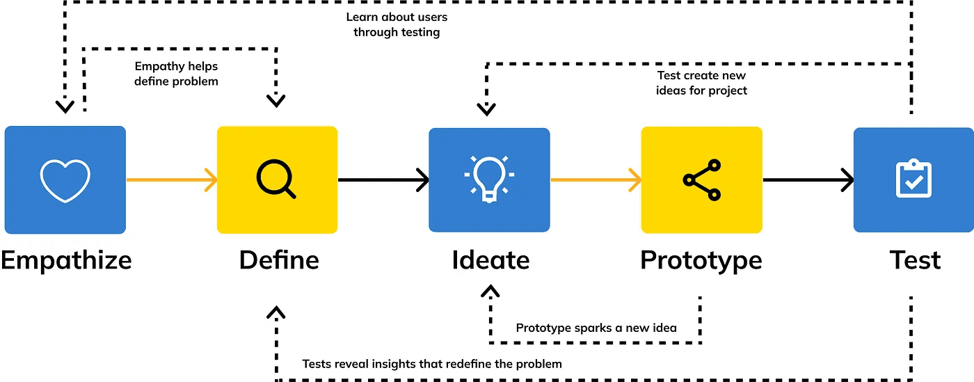
To create a design that truly fits the purpose, I need to do more research to understand the needs, habits, and preferences of users when learning.
Stage 1 — Empathize
The goal is to find out what kind of learning style they need to feel comfortable, beta, and motivated to continue learning on this platform.
User research (I use in-depth interview method to dig more insight)
In conducting this in-depth interview, I used qualitative data, by interviewing 3 people via zoom who met the following user criteria :
Age 18–55 years
Working as an employee
Domiciled in the territory of Indonesia and able to speak Indonesian
Have an upper middle economic level
Have attended online courses
And the objectives of this in-depth interview are :
Know the habits/experience of users when accessing online learning
Knowing Needs and Preferensi User when accessing online learning
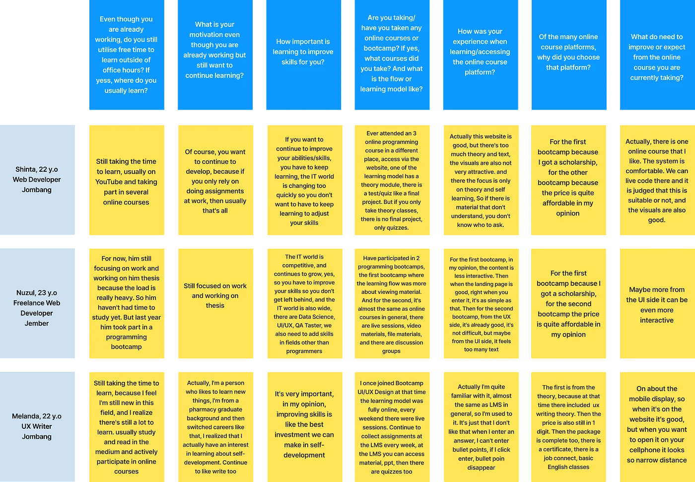
The following is a list of questions used in this in-depth interview:
Even though you are already working, do you still utilise free time to learn outside of office hours? If yess, where do you usually learn?
What is your motivation even though you are already working but still want to continue learning?
How important is learning to improve skills for you?
Are you taking/have you taken any online courses or bootcamp? If yes, what courses did you take? And what is the flow or learning model like?
How was your experience when learning/accessing the online course platform?
Of the many online course platforms, why did you choose that platform?
What do need to improve or expect from the online course you are currently taking?
Results of In-Depth Interview
From the questions that were asked and the answers given by the respondents, I grouped the answers according to the context of the question. Here are the results :
Stage 2 — Define
After conducting in-depth interviews at the emphatize stage, I have obtained the desired data. Next, I classify the data obtained from the emphatize stage and data result from company research to find out what problem points the user is experiencing.
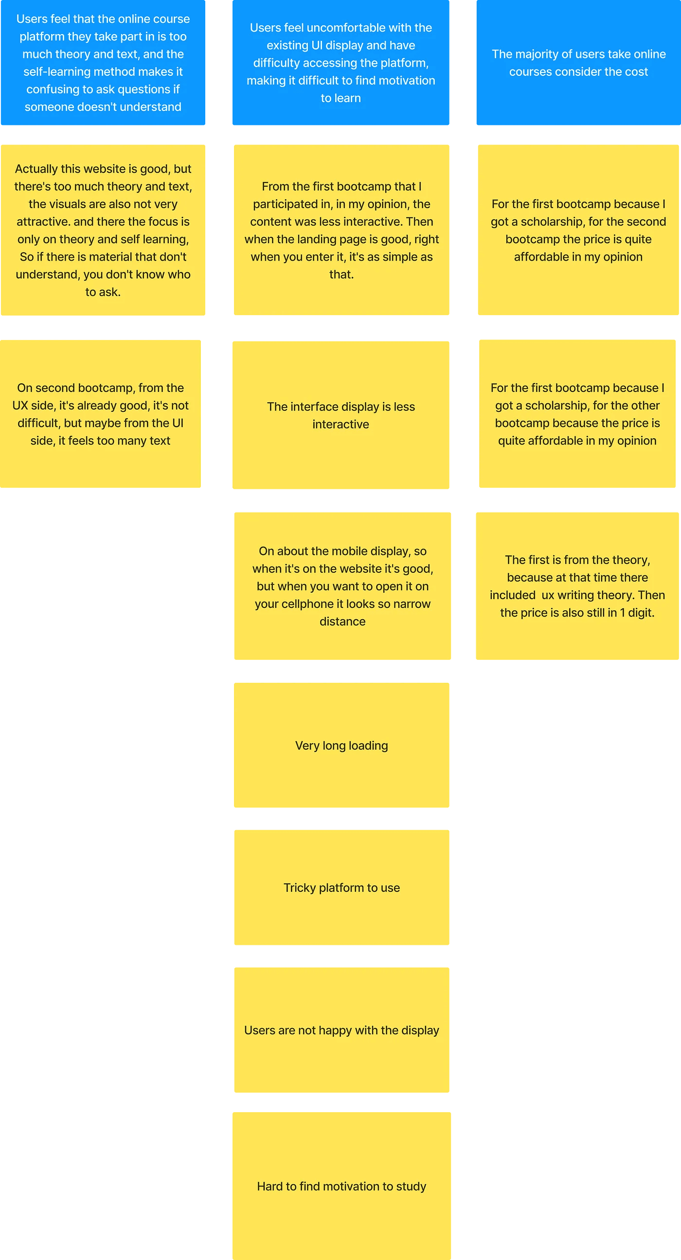
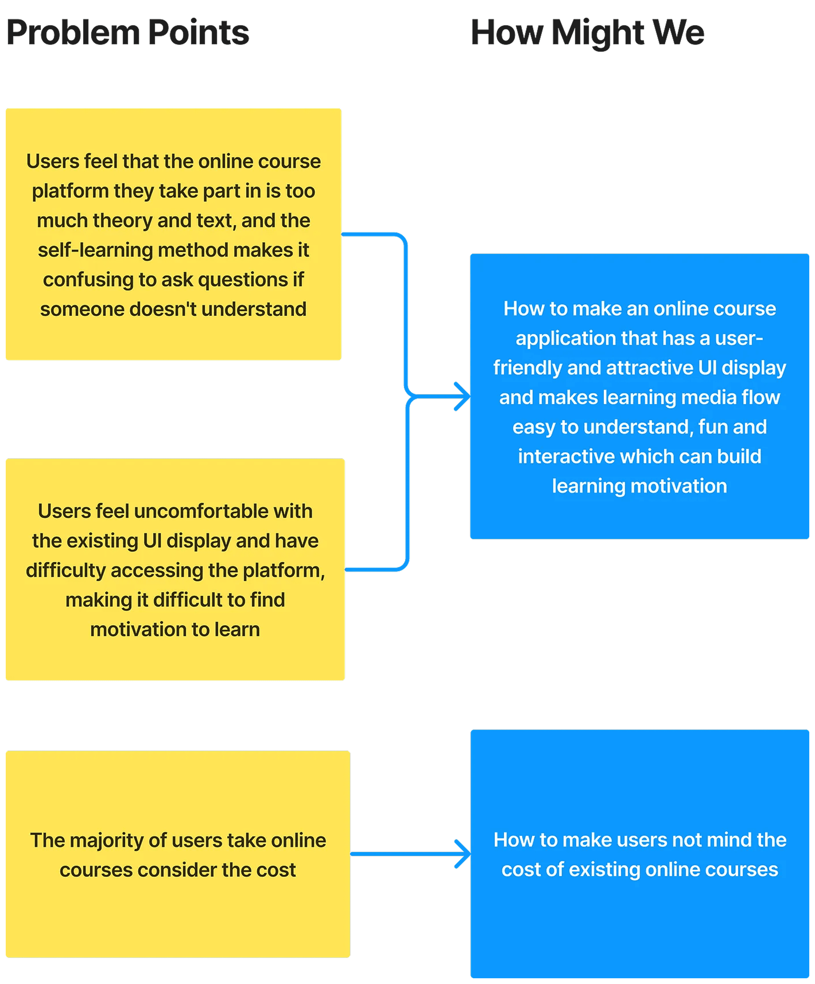
From the problem points that have been mentioned, there are some important problems that need to be solved :
Users feel that the online course platform they take part in is too much theory and text, and the self-learning method makes it confusing to ask questions if someone doesn’t understand
Users feel uncomfortable with the existing UI display and have difficulty accessing the platform, making it difficult to find motivation to learn
The majority of users take online courses consider the cost
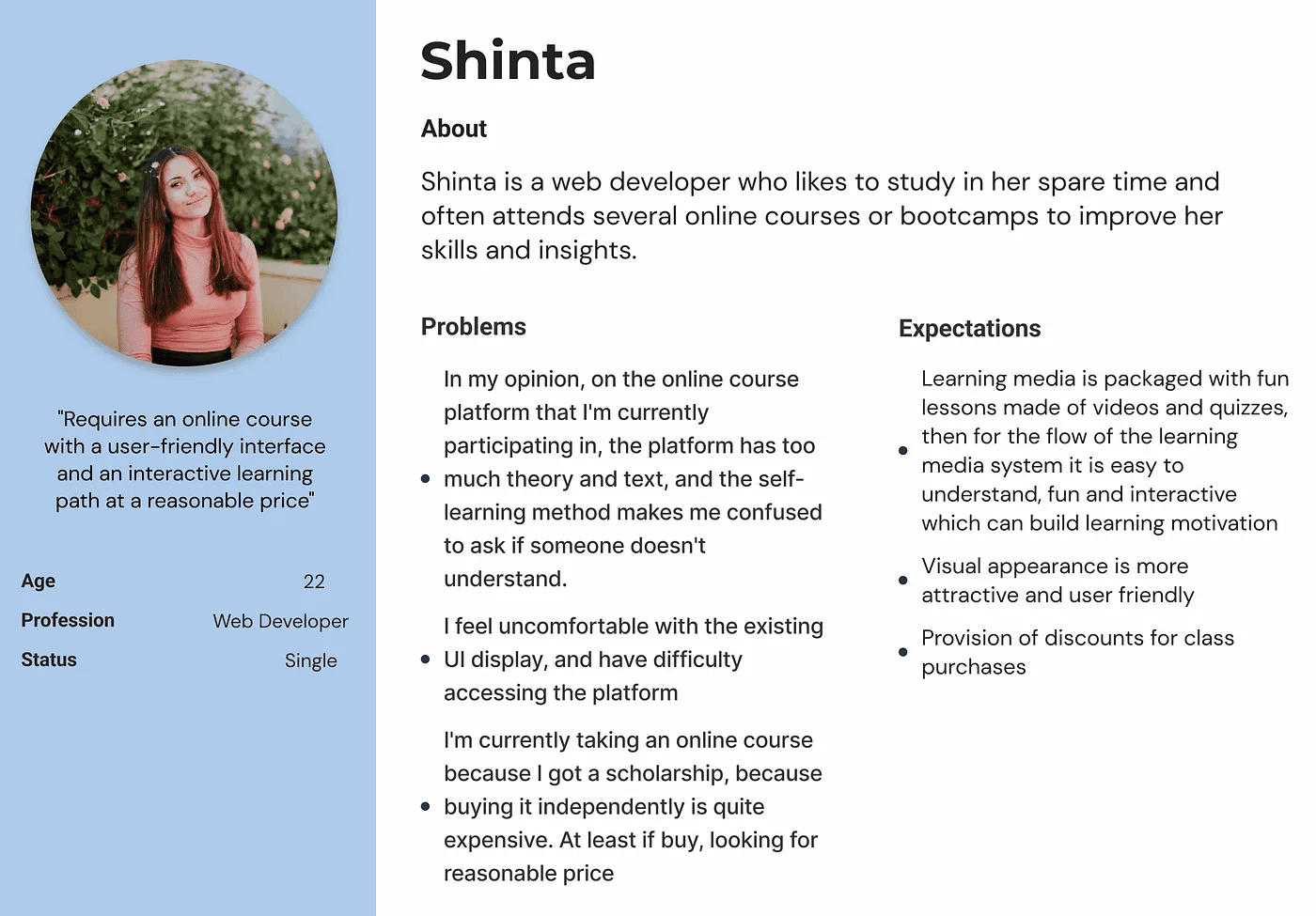
User Persona
Then i create user persona, persona is a characteristics that represents a group of product users. The objective is to understand the user’s objective and needs. It also helps to keep focused on user’s problems that needs to be solved.
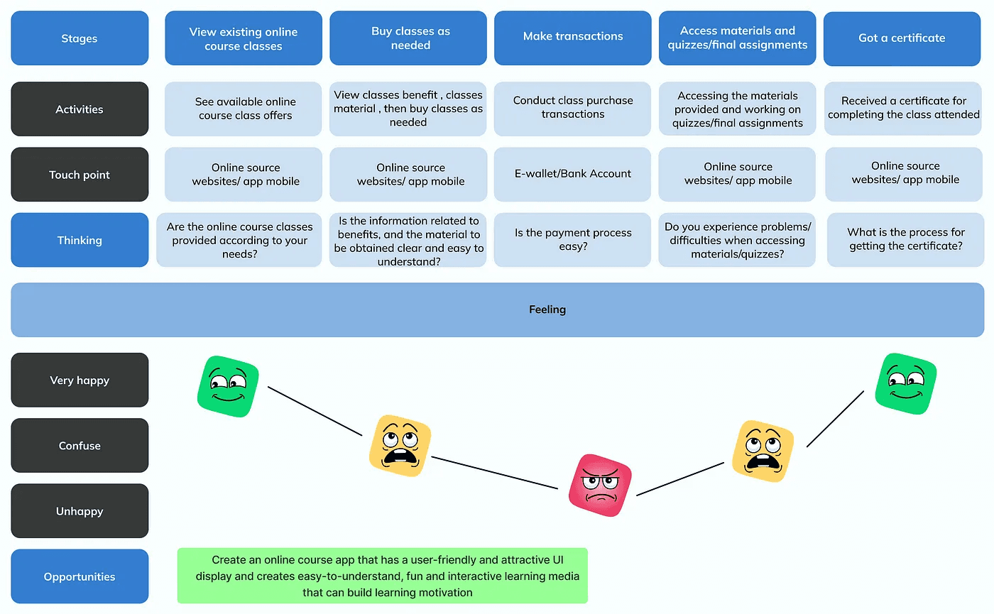
User Journey
Here I also create a user journey to find out the experience and habits of users when accessing online course platforms.
How Might We?
And then, based on those key problem points, I created a solution in the form of a “How Might We” list. Here are the results :
Stage 3 — Ideate
In this stage, generate ideas and solutions to solve the problems that have been collected at the Define stage.
Solution Ideas
After I get the grasp of the user problem point and know how might we solve it, I dig down deeper and did a lot of brainstorming for generate features ideas that might help users based on the “how might we”. Here are the results :
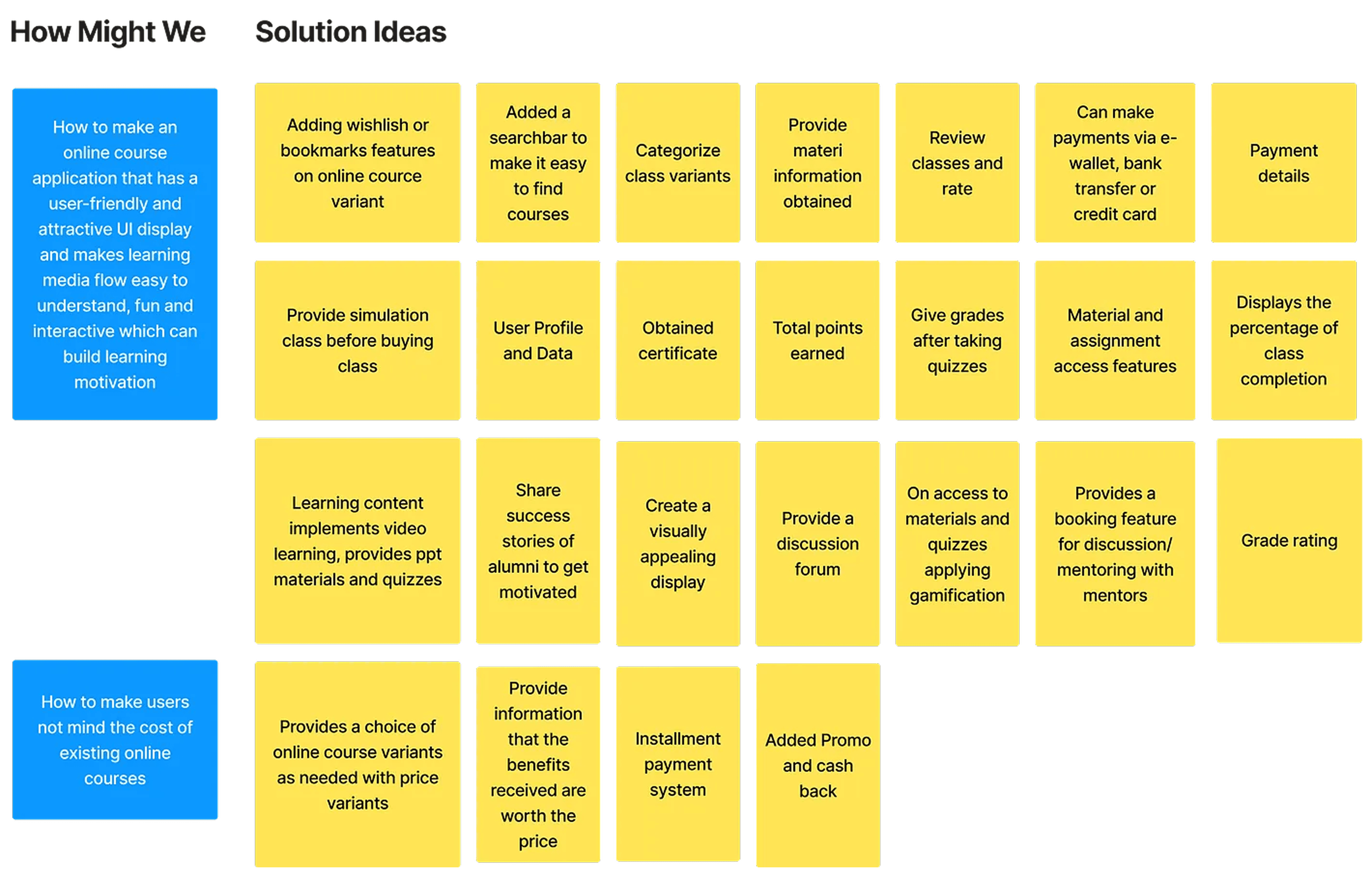
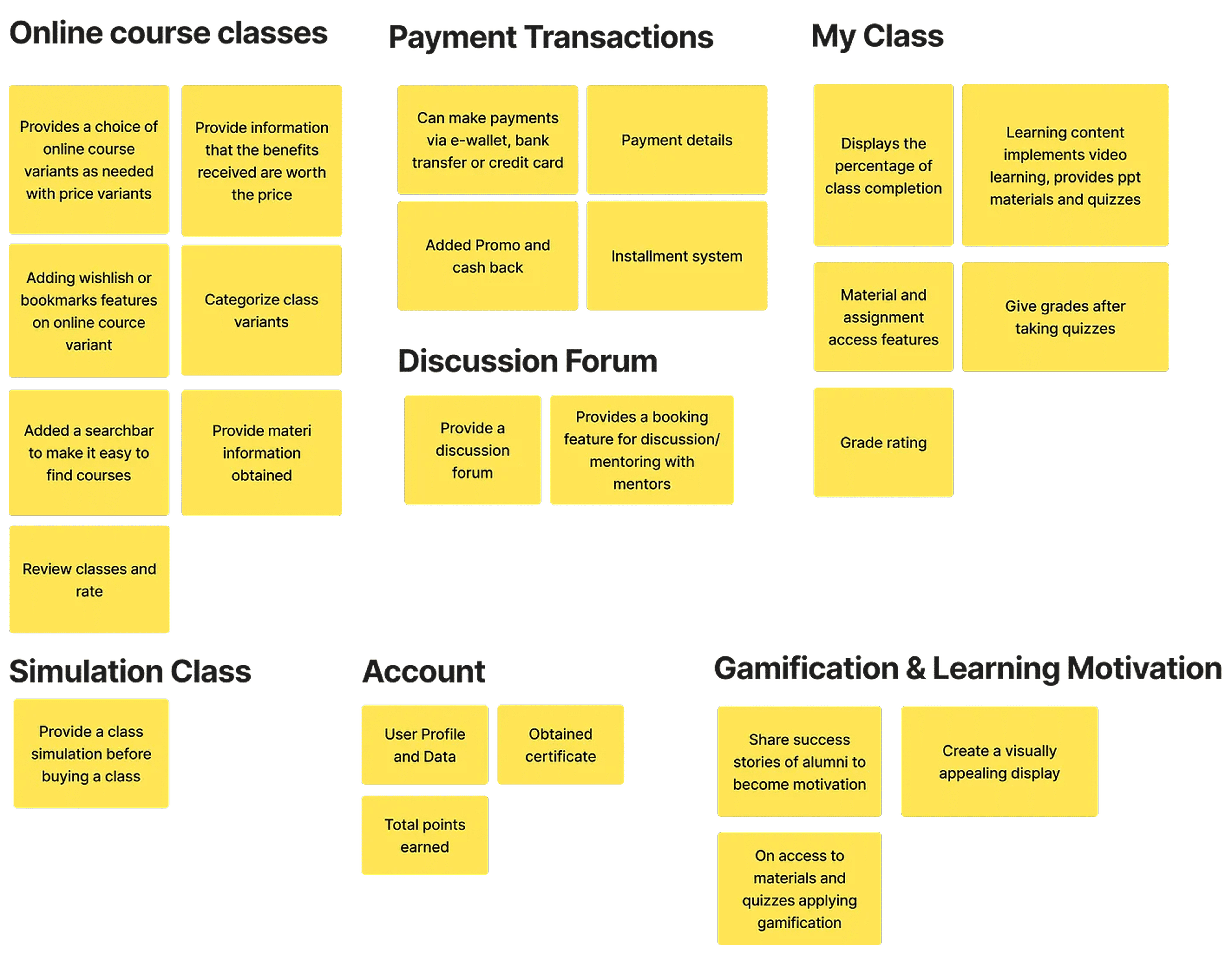
Diagram Afinitas
Then I grouped the ideas into an affinity diagram, and here are the results :
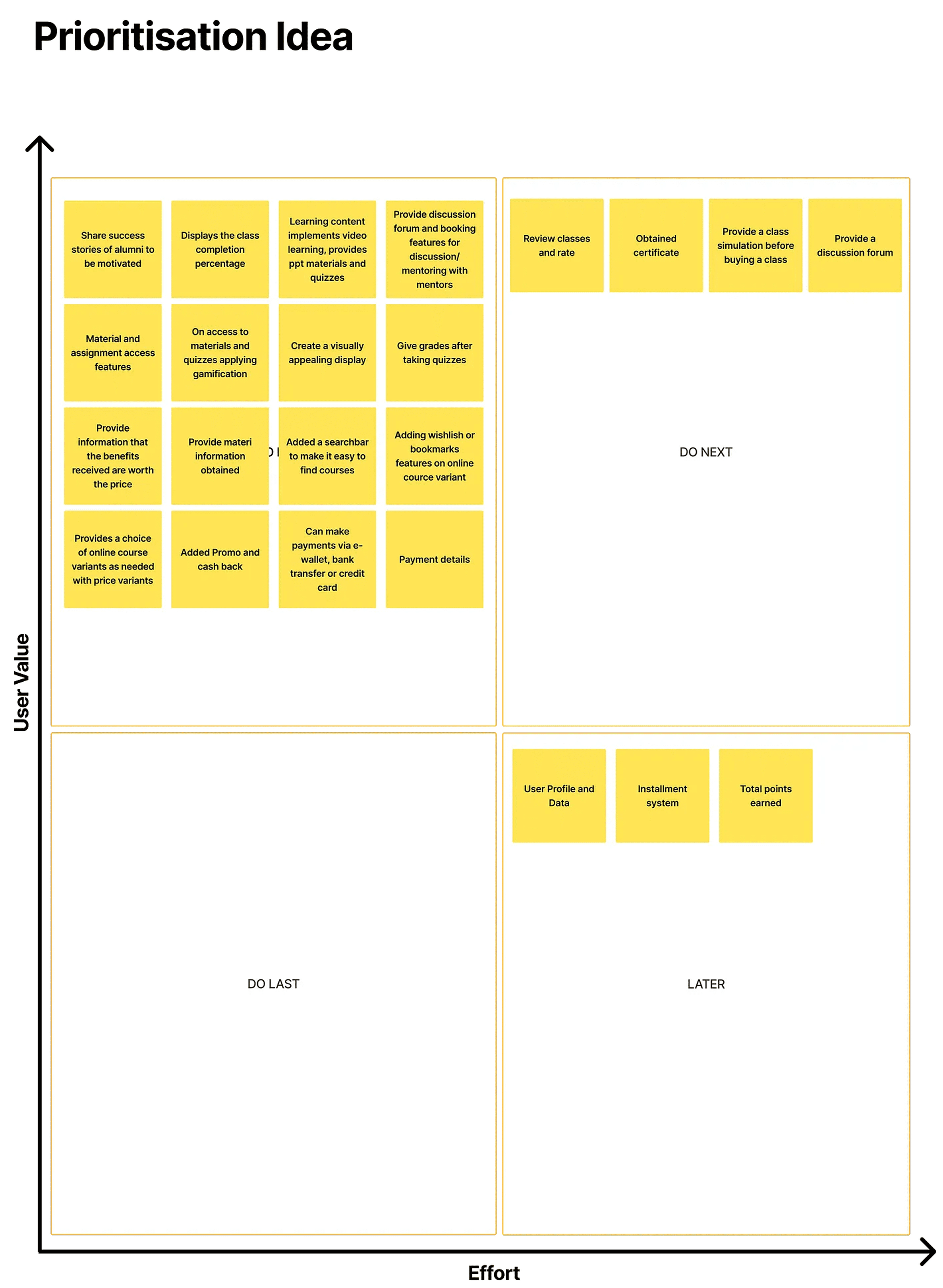
After I grouped ideas into affinity diagrams. I voted again for prioritize the ideas, so I can create solutions that measured by how much it will give an impact to business, internal and also customer. This is really important to determine which solutions that should I prioritized.
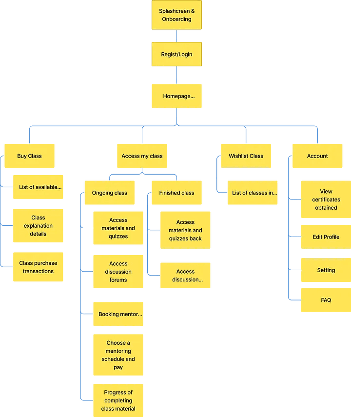
Information Architecture
After that, I create information architecture, information architecture functions to make it easier for users to find and understand the functions and content presented in the application, other than that was made to help the process on creating user flow.
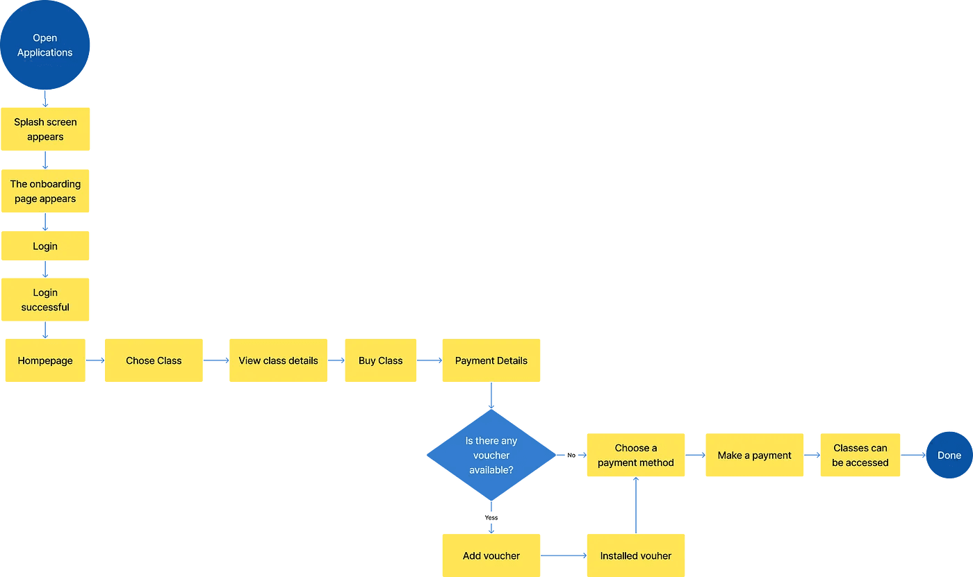
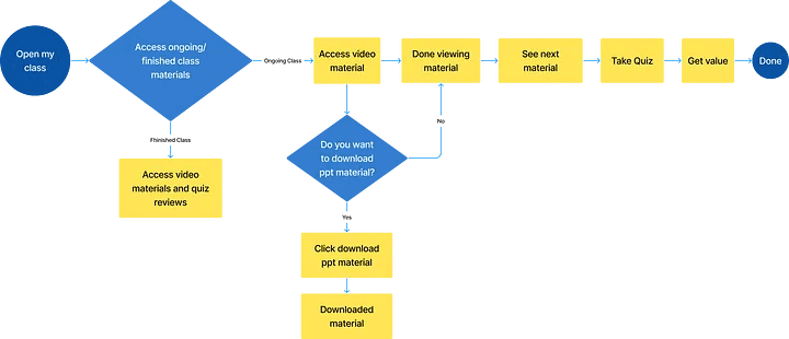
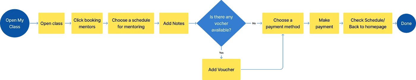
User Flow
Then i create user flow, User flow is a process or steps that users do to reach their goals/their objective when using this product.
This is the result of the user flow that I have created :
User Flow Acsess the Homepage and Purchase The Class
User Flow Access Materials and Take Quizzes In My Class
User Flow Booking Mentors For Mentoring
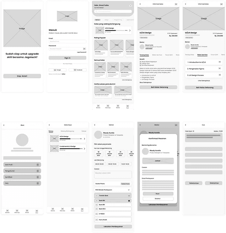
Wireframe
I made a wireframe to create a more detailed design framework before creating a high fidelity design. Here is the wireframe for Jagotech :
Stage 4 — Prototyping
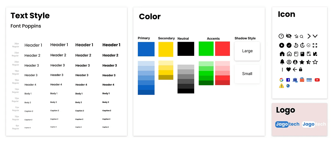
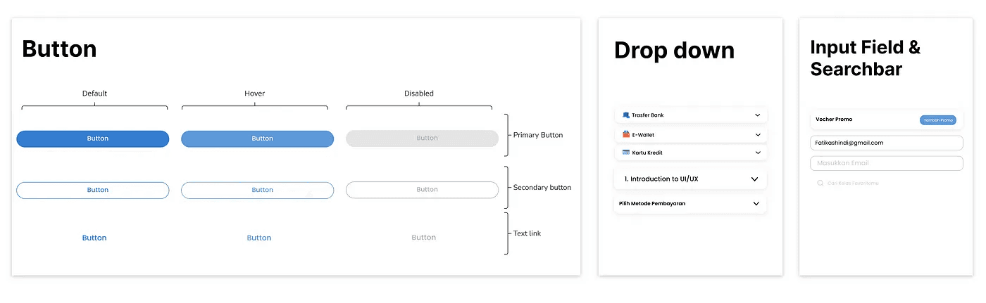
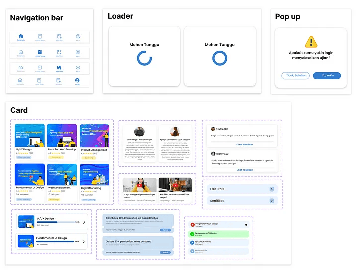
After all the concepts are ready, then I develop the UI. I made a design system first, here I use the main color blue because it can make us more optimistic, and make us feel more comfortable and relaxed, so it is hoped that users can feel comfortable and optimistic. I also use the text poppins type to make it look casual but formal. Here are the details of the system design that I have made :
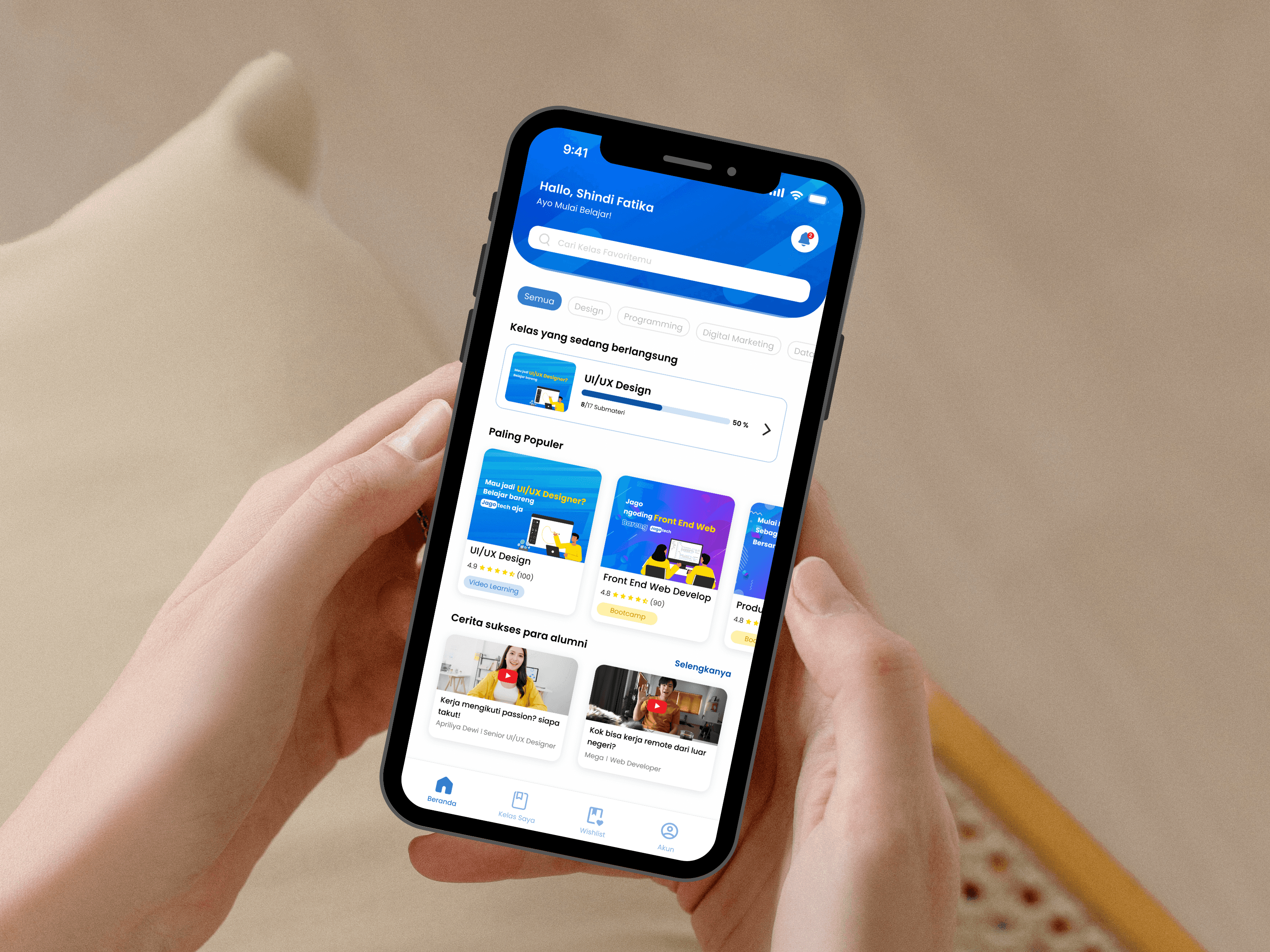
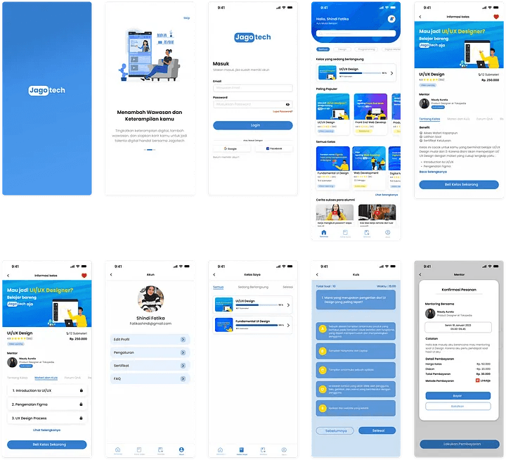
High Fidelity UI
Yeyy finally, we enter the stage of making High Fidelity Design by applying the design system that I have made. This is the result of my UI design :
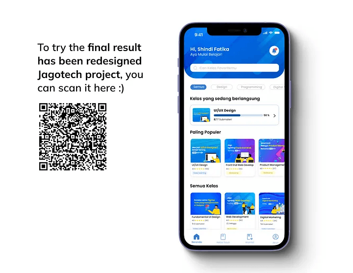
Prototype
After I finished the user interface design, the last step for this process is to make a prototype so that the design can be tested.
And here are the results, I very exiced to share this, please try :)
Stage 5 — Testing
User Testing is the last process of the Design Thinking Process that help validate my ideas. I do this process using usability testing methods (In-depth interview), which aims to Knowing the usability, convenience, and user satisfaction about the design app.
To find out the level of success of the design, there are several criteria:
Users feel comfortable with UI Design
Users can easily complete their tasks
Users understand the data provided
Users feel energized and eager to learn
Task
At this stage, I give the respondent several tasks to complete in order to get the information I need. Before the participants work on the assignment, I explain a bit about the features and tell them when to start and when to stop.
Tasks given to Respondents
I give them 3 tasks like I create a user flow :
Task 1 — Acsess the Homepage and Purchase The Class
Task 2 — Access Materials and Take Quizzes In My Class
Task 3 — Booking Mentors For Mentoring
To get more information, I also ask a few questions after the respondents have finished each task.
Test Results
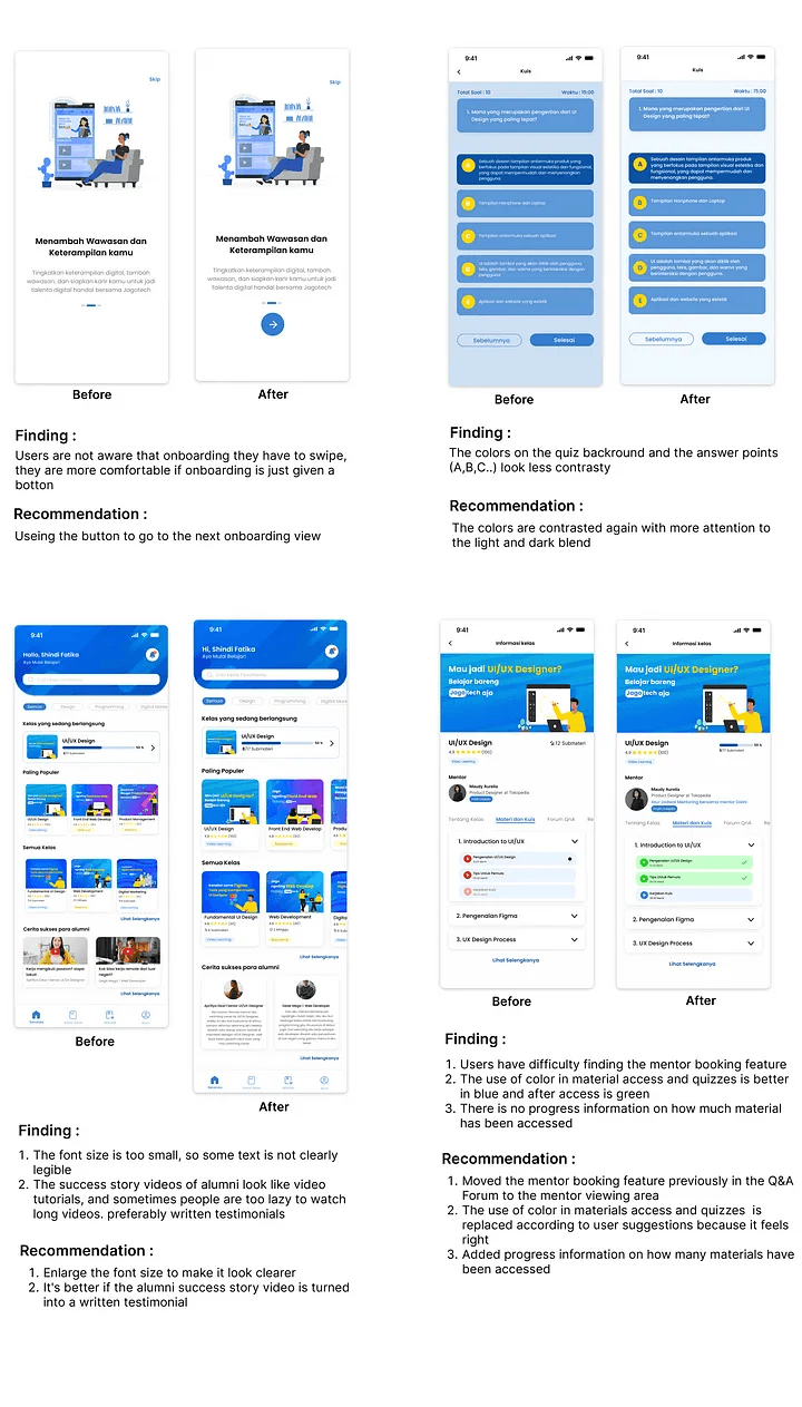
After I did usability testing on 3 respondents who met the criteria, Most of the respondents considered this application to be good, according to them the flow of using the application was also easy to use. and he thinks the interface design is good. However, there were several corrections from respondents including the following :
Small font size so it’s not too visible, can be raised
Onboarding is more comfortable using buttons than swipe
It is better to videos of alumni success stories in the form of written reviews/testimonials
The play button for materials and quizzes is better blue and when after accessed the color changes to green
Add progress tracking how many have been accessed / done in class detail
The use of color in the quiz display can be contrasted
The mentor booking button can be moved to the mentor area
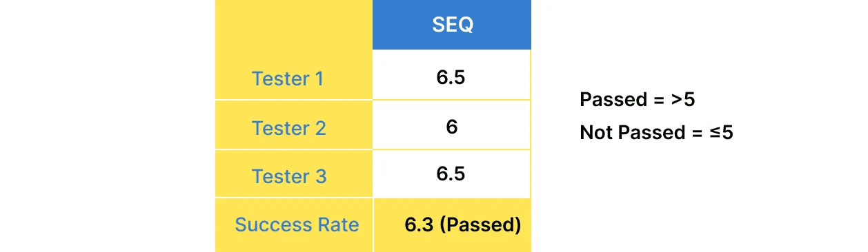
Single Ease Question (SEQ)
From points 1–7, the average SEQ score of the respondents is 6.3, with reasons most of them think this application is good, according to them the flow of using the application is also easy to use. and he thinks the interface design is good. However, there is some feedback for this application to be better.
Iteration
After I getting the result of usability testing, I decided to do iteration based on user feedback so that the application is maximized, here’s the result :